Function Home 42″ Media Console: how it fits your space

A cool, veined surface meets a slender gold frame, and you notice the scale before anything else. In the living room you see the Function Home 42″ media console settle into the space like a low, deliberate shelf—its faux-marble top reads smooth under your hand while the thin metal legs lift the piece so it feels lighter then its width suggests. Three open tiers form a simple rhythm of surfaces, the lower shelves low enough to tuck in a stack of books or a game box without vanishing into shadow. Small leveling feet peek out at the base, and light catches the gold finish differently as you move around, giving that first impression a quiet mix of glam and restraint.
at a glance the media console and how it sits in your room

At first glance the console reads as a low, linear anchor along the wall — it quietly holds whatever sits on top without demanding the eye. From a seated spot on the sofa you’ll notice how the horizontal lines guide sightlines across the room; the space beneath keeps the floor visible so the piece doesn’t feel like a visual block. In practice you’ll nudge it a few inches now and then to tune glare from windows or to line it up with a rug or artwork, and small changes to placement can shift how prominent it feels.A few everyday touches tend to matter: leaving a little breathing room on either side helps traffic flow, while centering it under a wall element makes the arrangement feel intentional rather than crowded.
How the console sits in your room affects day-to-day use as much as appearance — cords and devices are easier to manage when you can get behind it,and you’ll find yourself adjusting the fit to match seating height and sightlines. If the floor isn’t perfectly even you may tap or twist the feet until it settles; it’s the kind of piece you alter a couple times during first-week living and then mostly leave alone. Below are common placement scenarios and what you might expect from each in everyday life:
- Centered on a long wall — feels deliberate, creates a focal zone across the room.
- Floating in an open plan — defines a media area but may require more cable management.
- Tucked into a corner — saves circulation space, changes how the top surface reads from seating angles.
| Placement | Visual effect | Practical note |
|---|---|---|
| Against a flat wall | streamlined,balanced | Easy to hide cords; aligns with wall-mounted elements |
| Under a window | Light softens the surface,can reduce perceived weight | May need to shift for glare at certain times of day |
| Between two pieces of furniture | Acts as a bridge in the layout | Watch for clearance when opening doors or drawers nearby |
The marble top and gold base up close with the lines and finish you notice first
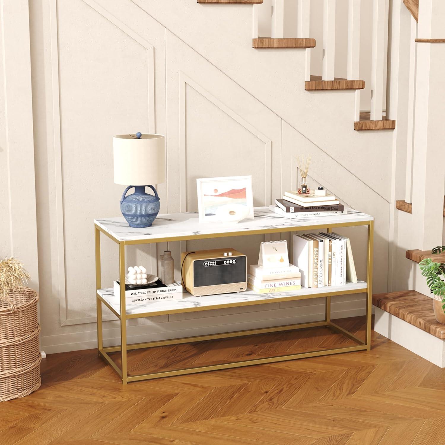
When you step in close the surface grabs your eye first: the pale field of the top is crossed by veins that run in irregular, slightly feathered strokes rather than a sharp, high‑contrast pattern. Under room light the finish sits between satin and a soft gloss — it reflects enough to pick up highlights but doesn’t come off as mirror‑bright. If you pass a fingertip across it you’ll notice a very smooth feel with the slightest sense of printed texture where the pattern meets the edge; it doesn’t feel cold or heavy like natural stone, and small smudges tend to be visible in direct light but lift easily with a quick wipe.
The supporting frame reads as a set of clean, geometric lines that frame the top without drawing attention away from it. The metal has a warm, muted gleam and the joins where the pieces meet are tidy, with welds finished down rather than left raw, so the lines look continuous when you glance around the piece. A few quick observations you might notice up close:
- Veining: soft, non‑repeating strokes that blend into the surface rather than sitting on top of it
- Sheen: semi‑reflective finish that shows highlights and fingerprints under bright light
- Frame lines: thin, straight profiles with concealed connections that emphasize negative space beneath the top
| Finish element | What you notice |
|---|---|
| Tabletop surface | Soft veining, smooth feel, gentle sheen that catches light |
| Edges and seams | Clean, squared edges with minimal visible seams |
| Metal frame | Warm, satin gold tone with uniform coating and neat joins |
Under the surface materials and construction details you can see and touch

you can feel the faux‑marble top before you notice it visually: the surface has a thin,slightly toothy laminate that reads as stone to the fingertips rather than cold quarried marble. Along the edges the laminate folds over a fiberboard core, and where the top meets the metal frame a narrow seam is visible—there’s a faint line and a slight step if you run your hand across it. The gold metal base is finished smooth and warm to the touch, with tiny weld beads and installed screws visible under the lower shelf if you crouch down; paint build is even in most places but you can sometimes feel a small burr near a joint. Flip the unit up on its side and the underside shows stamped metal brackets, labeled hardware slots and molded plastic caps over some connectors; the adjustable feet thread into metal sleeves and have rubberized pads that compress slightly against flooring.
When you handle the shelves or tinker with assembly,these tactile cues repeat: finished top,exposed fasteners,powder‑coated frame,plastic leveling feet and routed fiberboard edges. A compact reference table below summarizes those touchpoints you’ll most often notice while setting up or using the console.
- Visible hardware — screw heads and brackets sit flush or slightly recessed.
- Frame joins — weld marks and paint overlaps are modestly perceptible.
- Feet and pads — threaded stems and rubber pads respond to gentle pressure.
| component | What you see | What you feel |
|---|---|---|
| Top surface | laminate with printed marble veining | slight texture, firm over fiberboard core |
| Metal base | Gold‑tone powder coat, visible welds at joins | Smooth finish, minor raised weld beads |
| Leveling feet & underside | Threaded stems, rubber pads, plastic caps | Compressible pads, coarse metal threads |
How its proportions and shelving align with the TV sizes you bring into the space
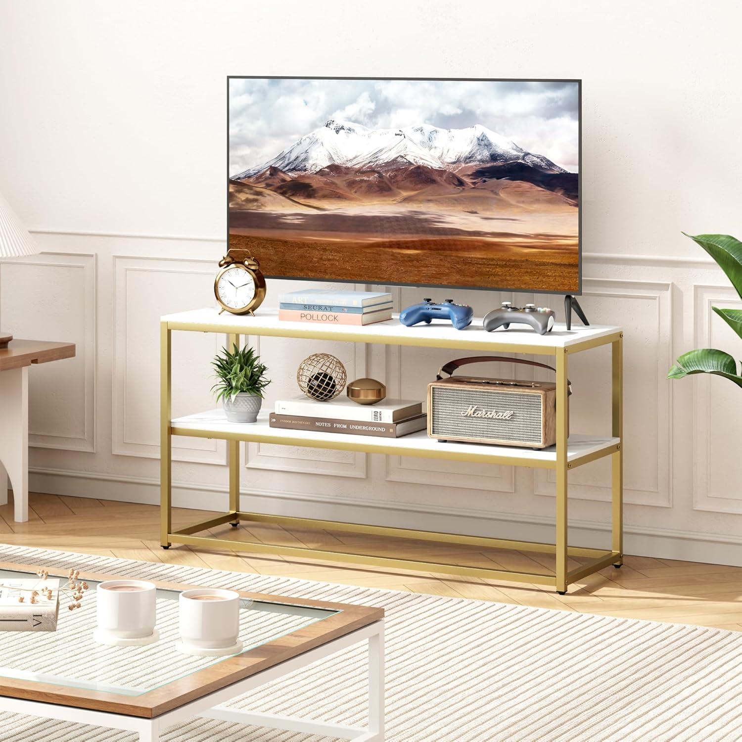
The stand’s proportions make the relationship between screen and surface easy to read at a glance: smaller screens leave clear stretches of tabletop showing on either side, while televisions near the upper size limit sit closer to the edge and visually dominate the top plane. As the shelving is open and relatively shallow, components tend to lie flat and frontal—soundbars and slim consoles rest neatly on the middle tier, while taller receivers may need to be oriented horizontally or placed on a lower shelf with more headroom. Wall-mounting a screen over the unit changes that balance; shelving then functions more as a media staging area than a direct visual companion to the TV, and cable routes or remote sensors frequently enough determine which shelf is most practical for everyday use.
- Smaller screens (under 40″) — usually leave visible tabletop on both sides and create a lighter,more open arrangement.
- Mid-size screens (around 40–48″) — tend to align with the stand’s visual center, filling the top without appearing cramped.
- Near-maximum screens (around 50″) — frequently enough sit close to the stand’s edges, which can make shelf placement feel secondary to the screen.
| Component | Typical fit on shelving |
|---|---|
| Soundbar | Front-mounted on middle shelf or on tabletop beneath the screen |
| Streaming boxes / game consoles | Lay flat on middle or lower shelf with room for ventilation |
| Tall AV receivers | May require placement sideways or on a lower shelf with more clearance |
See full specifications and current configuration options
Living with it day to day and the ways it handles media gear clutter and traffic

Daily use tends to be straightforward: devices sit openly on the shelves where they’re easy to reach, cords are visible and often require some bundling to keep things tidy, and the top surface becomes an informal landing spot for remotes, game controllers, and the odd mail piece. With ordinary foot traffic nearby, items that already sit near the front edge can shift a little when someone passes, and dust settles more quickly on exposed surfaces than it would in a closed cabinet.cable runs remain the most persistent clutter issue — power bricks and HDMI bundles collect behind and between components, so routine tidying is part of the rhythm of living with it. In most cases airflow around electronics is unobstructed, which helps devices that run warm, but the openness does mean visual clutter is only managed, not hidden.
- Quick-access staging: remotes, streaming sticks, and small controllers are easy to grab and put down without opening doors.
- Device arrangement: larger consoles and receivers sit on lower shelf surfaces while slim devices tend to occupy the middle shelf where cables are easiest to reach.
- Maintenance rhythm: visible surfaces and cable bundles typically get a weekly tidy-up to keep the area from looking crowded.
| Common Item | Observed Placement/Behavior |
|---|---|
| Streaming box / small player | Placed mid-shelf for easy access to ports; cable runs visible behind unit |
| Game controller / remotes | Left on top or in a shallow tray on an open shelf; small clutter builds quickly |
| Soundbar / slim speaker | Typically rests on the top surface with direct line to TV; minimal obstruction to ventilation |
Full specifications and configuration details are listed on the product detail page: See full product details on Amazon.
How it measures up to your expectations and the limits of your room

The piece tends to read as visually light in most living spaces: its open tiers keep sightlines unobstructed and the top surface catches light, which can make a narrow room feel a bit less crowded. In practice, the openness also means components and cords are more visible, so occasional tidying becomes part of the routine rather than an afterthought. The adjustable feet make small height tweaks straightforward on uneven floors, though those adjustments are typically done once during setup and re‑checked if the console is shifted. Small, everyday habits—sliding a rug slightly, angling a lamp, or nudging a decorative object—often determine how seamlessly it settles into the room’s traffic flow.
- Stability: Adjustable feet and the base geometry tend to keep the unit level on imperfect surfaces,though heavier rearrangements usually involve lifting rather than dragging.
- Visibility: Open shelving eases access and airflow for electronics but requires intermittent dusting and attention to cable association.
- Spatial trade-offs: The low profile preserves vertical sightlines but can limit space for taller decorative items or stacked components on the shelves.
| Placement | Typical room effect |
|---|---|
| Against a wall | Creates a neat anchor point; cords remain more exposed unless routed behind. |
| Centered on a short wall | Keeps the room feeling open but may require deliberate styling to avoid a bare look. |
| In an entryway or narrow space | Provides surface and display room without overwhelming the passage, though top clearance for tall items is limited. |
Complete specifications and configuration details are listed here.
Simple upkeep and accessory compatibility that keep it working in your home

Keeping the console working around the house mostly comes down to small, familiar chores rather than deep maintenance.A quick wipe of the tabletop and shelves after meals or craft projects takes care of most marks; spills that sit a while can dull the finish, so blotting sooner than later tends to help. Every few months you may notice a leg needing a small twist to stay level on uneven flooring or a loose fastener after a move — making these tiny adjustments as they appear keeps the unit sitting straight and reduces squeaks. For everyday wear, simple habits like using coasters under drinks and lifting rather than dragging heavier objects across the surface prevent scratches and scuffs without special cleaners.
Accessory compatibility is largely straightforward because of the open shelving and accessible rear areas, though some common patterns repeat in lived use. Low-profile soundbars and streaming boxes usually sit without fuss on the top or a middle shelf, while bulkier game consoles or AV receivers need a little breathing room for ventilation and cables. Small,routine steps—tucking power strips toward the back,leaving a bit of clearance for airflow,and keeping the remote sensor line unobstructed—make components behave better over time. A quick reference table below summarizes typical accessories and what to look for when pairing them with the stand.
| Accessory | Typical compatibility note |
|---|---|
| Soundbar | Fits on top or shelf in most arrangements; low-profile models sit flush, taller ones may need front clearance. |
| Streaming box / Stick | Needs clear access to power and HDMI; wireless remotes work best when the sensor line is unobstructed. |
| Game console / AV receiver | Prefer some open air around vents; place toward the shelf edge for easier cable routing. |
| Power strip / Surge protector | fits behind components; avoid blocking ventilation and allow easy access to switches. |

How It Lives in the Space
You notice, over time, how the Function Home TV Stand for TVs up to 50 Inch, 3 Tier Entertainment Center, Modern TV Cabinet with Marble Top and Gold Metal Base, 42″ Media Console Table with Storage for living Room Bedroom settles into the room’s rhythms rather than declaring itself. In daily routines its surface becomes a place for a cup or a remote and the shelves quietly collect the things you reach for most, shaping how the space is used and how cozy it feels to move around.Small scuffs on the metal base and faint marks on the marble top appear in regular household rhythms and make it read as lived-in rather than new. After ordinary days together it simply becomes part of the room and stays.